Tuesday, December 18, 2012

The Family Artwork...

Since this blog is about my artistic influences, it would be incomplete if I did not mention the most obvious of those--my family.  This is not an awards ceremony sentiment (i.e. I would like to thank my fans, my manager, my family, my dog...).  Although I won't deny sentimental bias, the artwork that my family members make has directly influenced my own.

At some point I will have to write an entry about my family's musical pursuits (my mom, some cousins, aunts, etc.), but that would be paragraphs in and of itself.   So for now, I will just focus on two of the visual artists in my family, whose work I have for so long respected and been influenced by.

The first influence, is my great grandmother.  Some of the very first artwork that I saw was hanging in my bedroom, and among the pieces was this one:


It is a picture of a fox breaking into a fence near a chicken coop.  Although I am not sure about the exact knitting/weaving/crocheting method she used, the image is made out of colored yarn.  The picture came directly from my great grandmother's imagination, and I am told that she made them without patterns.  The subject matter is similar to mine, and the attitude of the fox, and the animal's inherent personality have greatly influenced the way I portray animals in my work.  The use of color has likely been influential as well.  

Cumulatively, I spent hours staring at the picture of the fox, as it was on my wall for years.  As a result, I do not think it would be possible for me to overstate the influence of this one image.  Apart from the immediate aesthetic results of this inspiration, my great grandmother's work has one other implication.  Though my work has a clear folk-art element, it is not necessarily an exclusively American one.  My great grandmother was from Latvia, and her influence on my work partially ties my own into a slightly different folk art heritage.  

The second influence on my art is the photography of my father.  We are both interested in similar subject matter: urban decay, the modern city, rusty things, old infrastructure, nature, farms, etc.  Although I do not have many of his images available at present, one is below:


My dad's photography champions the underdog.  His pictures center on items that have long since been forgotten or abandoned: buildings that no longer house anything; city streets which only seem to lead away from town.  I have always been impressed by his ability to zoom in on a detail that would otherwise be overlooked--it is both a compositional talent, and a natural ability to find value in the realm of the forgotten.  Though I do not do a lot of photography, I would like to think that the artistic decisions that fuel his work, have improved my own.  

The influence has also been direct at times, as in my drawing below:


Monday, December 17, 2012

Edward Hopper

                                                    (Click Here to View Photo Source)

Though most of my blog posts have been about artistic pieces and products that were either not intended to be high art, or are not currently considered such, there are some "serious" artists whose work I enjoy.  Among them is Edward Hopper (though even his work is tenuous for some).

Though his style is fascinating, and his paintings reflect a sense of longing and nostalgia that I enjoy, there is another characteristic of his work that I find the most compelling.  While paintings of urban landscapes are fairly common, they usually take the form of sweeping panoramas, and dramatic skylines.  Hopper's approach is different... Rather than focusing on the city in the aggregate, he focuses on the city in the individual sense.  His works are often portraits of the people who make up the city.  Hopper's paintings are not faceless renditions of cities from the outside, but are carefully selected vignettes of what happens behind the walls of the urban landscape.

Such is the case with "Nighthawks," his famous image, above.  It would have been easy, and perhaps obvious, to paint the same scene as an anonymous view of some compelling architecture, completely aloof to the life within the buildings.  However, Hopper responds with X-Ray vision, penetrating through the difficult front of the urban landscape, to the humanity within.

Yet even this analysis, is a bit simplistic.  There are other painters who successfully portrayed human vignettes in a downtown setting.  For example, below is Norman Rockwell's famous diner picture.


Both Rockwell's image, and Hopper's "Nighthawks" nostalgically portray the insides of restaurants.  There is a major thematic difference however.  While Hopper paints from the outside looking in, Rockwell simply paints from the inside, looking further in.  As a result Rockwell is exploring humanity, and human relationships in general with a little bit of atmosphere to give his characters personality.  Hopper, on the other hand, is painting humanity in the context of the urban landscape.  The city is not just a setting, it is a character just like the people within his portraits.

It is this balance that makes Hopper's work so compelling.  He not only goes beyond the typical urban landscape painting to find the life within, but he then examines the two variables in relationship with each other.

The real question is whether Hopper is painting the relationship between man and city as harmonious or confrontational.  The decision is up to the viewer...


Rocky & Bullwinkle

Okay... so in my last post, I claimed that "Uncle Wiggily" was probably the greatest single influence on my work (take that Da Vinci!).  While this is largely true... two of my other childhood heroes were of equal (and in some ways, greater) importance:

                                                  Screen Shot, from Rocky & Bullwinkle

Though I enjoy the drawing/animation of Rocky and Bullwinkle, the Uncle Wiggily illustrations are really the gold standard of classic american animal illustration/cartoons.  The influence from Rocky and Bullwinkle on my art is different.

People who look at my images, often ask me how I come up with the crazy ideas that I paint (i.e. "Life on the Double P--A Story of Western Adventure on a Real Life Pet Peeve Ranch").  I have little doubt that the odd sense of humor in Rocky and Bullwinkle, with its cold-war satire and heavy use of irony and dark humor, has influenced my own.

It would be hard not to be moved by great philosophical quotes like:

       "No early worm is going to give me the bird!"

                  -Bullwinkle, Season 3: Episode 6 - Second Installment


Uncle Wiggily

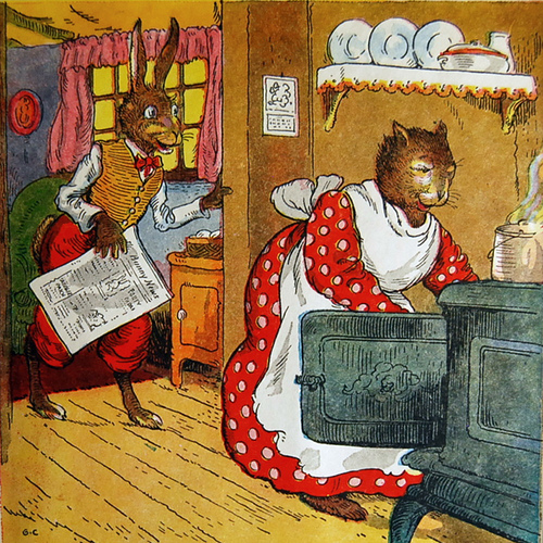
If I were to point to one thing that influenced my work more than anything else, it would have to be the "Uncle Wiggily" books.  A series by Howard R. Garis of some popularity in the early to mid 20th century, Uncle Wiggily was an elderly gentleman rabbit, with a car made of nonsense components and edible parts.  Though the writing was imaginative and fun, I was really in it for the pictures:

                                                                     unclewiggily.jpg

The use of color and line in the Uncle Wiggily illustrations is superb.  The portrayal of the animals is interesting, and the use of human elements such as clothing, cars, and houses is fascinating.  Though these pictures may not look revolutionary now, after decades of Disney and Warner Brothers cartoons with anthropomorphized animals... these might have been wild back in the day.  After all, these came first.    That suggests a bit of artistic influence...

Neil Young, Greendale

Uh-oh, a music album!  What's this doing in a visual arts blog?  I mean, the connection to actual "art" is already weak here...


Well, good question.  And it's not here because of the album cover, though I like the picture--that would have been a few posts back.  It is here because of the way Neil Young uses the album to tell a story.

Greendale, is a rock opera, about a family in a fictional town in California.  It is about their experiences dealing with tragedy, and of course, it's delivered with an environmentally friendly message.

But, the way their story is told, is highly unusual.  Greendale is not delivered like a straight-forward plot arc, with a beginning, middle, and end.  Instead, time in the album is relative.  The songs appear out of order, and they reference each other in a manner that makes it difficult to determine which one should have come first.  Additionally, only certain parts of the story are told, and large gaps are left between each point (or song), that the listener has to fill in via thematic interpolation.  It is sort of an impressionist album.  As Monet's lilypads were just an illusion of the real thing, rendered in a way that required viewer assumptions to connect them to the real item, Greendale requires similar amounts of effort on the part of the listener.

It's a fantastic way to tell a story.  Since my work is heavily based in the idea of narrative, I find the idea of using an abstract storyline fascinating.  Though I still tend to go for a literal, easy to follow plot, my most recent series is an attempt to imply narrative, without actually stating it.

'59 Cadillac

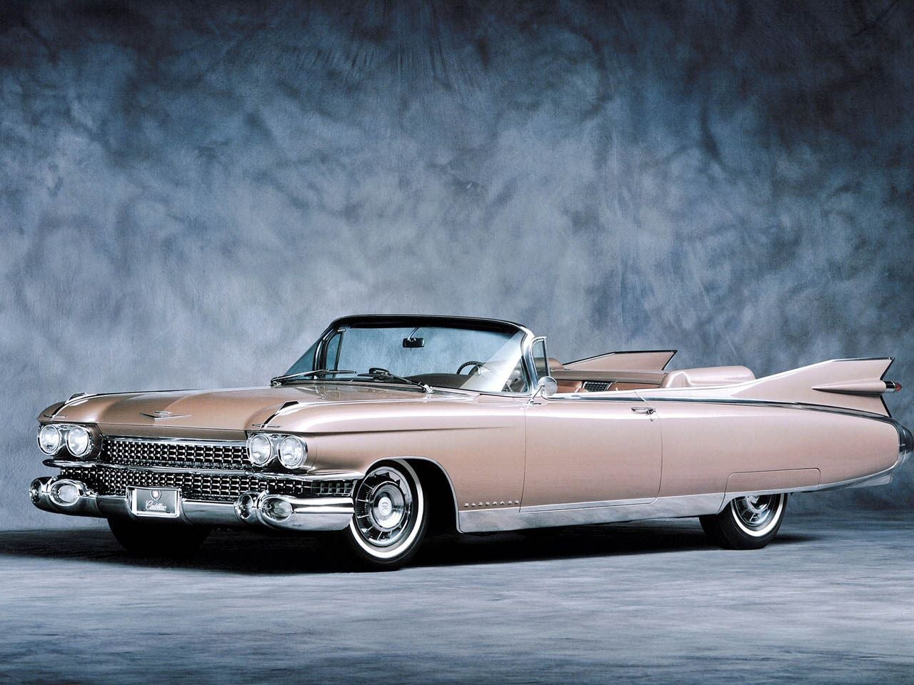
When I was in middle school, I did an entire series of paintings of animals climbing the eiffel tower, with pink, 1959 Cadillacs driving by underneath.  The design is of the car is so iconic, so outrageous, and so immediately recognizable that it lends a certain panache to a painting.  Or at least I thought so.


Though I have long since abandoned my animal/Eiffel tower/cadillac series, an emphasis on automotive design still plays an important role in my work.  When I paint or draw a picture now, I still often add vehicles, but now they are usually made up.  Adding a vehicle is a great way to date a piece, or add something visually graphic, but I also just enjoy the process.

This is most likely a result of all the time I spent growing up "designing" pictures of my own cars.  Though they certainly weren't accurate--often missing the little things, like doors, front wheel arches, and steering wheels--they almost always had respectable tail fins.  I owe that to the '59 Cadillac.  

Genre Discussions: Advertising Art

I am a big fan of classic advertising art.  It's hard to beat the attention-getting graphics, the top notch illustration, and the often unusual products and companies that have been forgotten by time.  The following three images were originally intended for use on shipping crates.  In other words, they were just decorative labels used to identify and label the products inside wooden boxes... the only modern day equivalent I can think of is the "Clemintine" logo on the ply-wood boxes they have in grocery stores this time of year.

Indian River Citrus Sub-Exchange--could it possibly be more specific?  


How about this one?  The earth is an apple!  


And perhaps best of all, a shipping label made specifically for sweet potatoes:


Not entirely sure how the rodeo girl on the white horse relates... but that's obviously not important!

While it is often only the most famous ads that make it into the collective memory of the nation, and the most successful products, it is not necessarily because they had the best art.  It is funny to imagine how the art world might have been different if one of the products above had become, or remained dominant in the U.S.  Warhol may not have gotten famous with prints of Campbell's Soup Cans and Marilyn Monroe-- it might have been Victorious Brand Sweet Potatoes and a cowgirl on a horse.